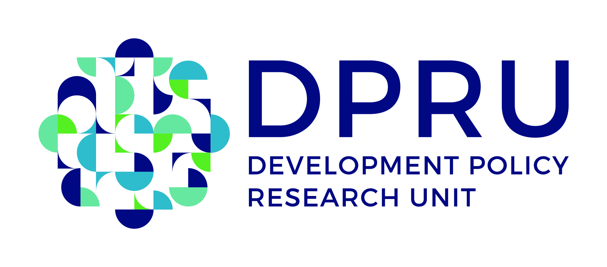
Unveiled: The DPRU's new look for #3DecadesOfTheDPRU

In celebration of the 30th anniversary of the Development Policy Research Unit in 2020, we unveil our exciting new logo, and share the concept behind the Unit's refreshed brand identity.
#3DecadesOfTheDPRU offers us a unique opportunity to create a compelling, modern visual identity - at the juncture of our heritage and our future - and allows us to actively:
-
Reflect on where we’ve come from;
-
Celebrate what we’ve achieved; and
-
Anticipate what we hope to still become.

The Concept

Inspired by circles and the various concepts that they can represent in this space, we explored scatter plots on a graph representing correlation; interconnecting circles showing collaboration; and overlapping circles representing patterns emerging to show impact.

The single circle was broken down into multiple overlapping circles. Then, these were deconstructed into semi-circles and half circles. The negative spaces between circles were added to allow the pieces to flow into each other, representing the different aspects of research coming together to create insights.

The History
During the last 30 years, the DPRU has established itself as one of South Africa’s premier economic policy research institutions. The Unit received it's URC accreditation in 1990, and used UCT's branding before the first bespoke logo was created in 2006. Ahead of the DPRU's 20 year anniversary in 2010, a new look was commissioned. It incorporated an icon that played with stylised confidence intervals, dropped the acronym, and diverged from the UCT blues to include bright green. Our 2020 logo conforms to a similar approach - considering the conceptual and abstract, rather than picturesque - but includes our acronym and our full name, and embraces a more modern and fresh colour palette.

